Animation technology has progressed in leaps and bounds since the old days of 100% cel animation, allowing newer anime to use computer-generated imagery for amazing effects like dynamic camera movement and complex machinery. But if the CG is poorly composited, lazily made, or simply too primitive, it’ll stick out like your average shounen protagonist in a crowd of background characters. These moments are a big letdown in the context of the show itself, but at least they’re funny to watch! Here are five of our favorite instances of hilariously bad CG in anime!
5. The Colossal Titan from Shingeki no Kyojin Season 2 (Attack on Titan Season 2)

In general, Attack on Titan uses CG very sparingly – mostly for the high energy ODM Gear sequences – and it looks amazing because it allows for thrilling camera moves while still keeping the 2D art front and center. But starting in the second season, the Colossal Titan began to look a little... different. During its climactic re-entrance, its textures were too smooth and its movements were too stilted and unnatural. This creature made of warped flesh and bone no longer seemed like a part of this world, but rather an alien placed on top of it. CG tends to create the uncanny valley feeling, which the titans’ designs and movements purposefully lean into to make them seem creepier, but instead this giant monster just looked like a lumbering oaf. Hopefully season 4 will fix that!
4. The Cave Cricket from Suzumiya Haruhi no Yuuutsu (The Melancholy of Haruhi Suzumiya)
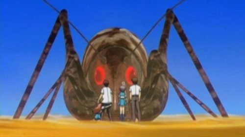
Even though The Melancholy of Haruhi Suzumiya is from 2006 and should therefore get some leeway for its CG sins, the giant cave cricket from episode 7 is just too ridiculous to ignore. It’s a data organism that forms from a glitch on the SOS Club’s website (the details are murky, as they tend to be in this anime) and attacks the group in a virtual desert. This massive creature looks like it came straight out of an early PS2 game and takes up significant time in the episode, making viewers feel like they’re stuck in a fever dream. Then again, Haruhi Suzumiya is essentially a fever dream from beginning to end, so perhaps this was all part of KyoAni’s plan...
3. The Transformation Sequences from Sailor Moon Crystal
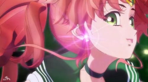
This remake of the ‘90s classic Sailor Moon decided to stick much closer to the original manga’s art style, meaning that the characters are tall and noodly with massive eyes and detailed hair. The Sailor Senshi look great in 2D, but the 3D transformation sequences from seasons 1 and 2 do them absolutely no favors at all. These highly stylized designs look like deformed action figures in CG, completely sapping the magic and beauty from these classic magical girl transformations. Luckily this got better from season 3 onward, when the studio wizened up and switched to 2D for everything.
2. The Helicopters from Golgo 13 (Golgo 13: The Professional)
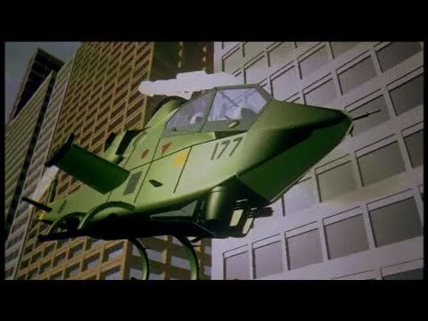
Here’s an astounding fact: Golgo 13, released in 1983, was the very first animated film to incorporate CG animation! Even before Pixar’s first short film The Adventures of Andre and Wally B debuted in 1984, this hard-boiled secret agent anime was paving the future of digital animation with its impressive shots of army helicopters circling a skyscraper! Well, it was impressive at the time, anyway. Now, the unshaded polygonal graphics look jarringly out of place against the Fist of the North Star style 2D animation, almost as if the 2D characters were paper cutouts and the helicopters were made of Lego. It just goes to show that, even if you’re the first to do something, you may not be the best at it.
1. Everything from Berserk
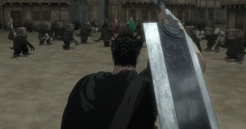
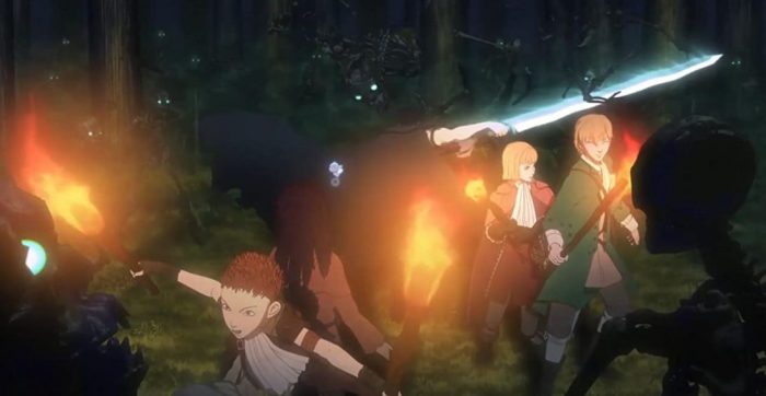
Berserk 2016 is so bad that it should be considered a war crime by the Geneva Convention. Never has a manga as beloved and illustrious as Berserk been had an anime adaptation this ugly, lazy, and insulting. Studio Millepensee (who have produced pretty much nothing of note) took Kentarou Miura’s godly art and rendered it in hideous CG with flat camera angles, stiff movements, and blank facial expressions. The only thing that comes close to this travesty is Studio Pierrot’s 2012 adaptation of Kingdom, which at least had some heart behind it if you could look past the shoddy CG. Vinland Saga got a gorgeous anime, so why can’t Berserk?
Final Thoughts
We’d also like to draw attention to the horse-drawn carriages from this season’s Kuma Kuma Kuma Bear and By the Grace of the Gods (which seem to be copy-pasted from Black Butler), the robots and monsters from GaoGaiGar, and of course the cars from Initial D. But what are your favorite hilariously bad CG moments in anime? Let us know in the comments, and thanks so much for reading!
Recommended Post
CGI Anime is Massively Underrated
Recommended Post
A Brief History of CGI in Anime
Recommended Post

