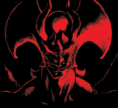
When anime fans make fun of bad animation, they tend to point out frames where characters are drawn “off model” – meaning that they’re way off from the model sheets that dictate what each character should look like. It’s important for artists to stick to these guidelines so the show can keep a clean and consistent look. But what if the director doesn’t want the animation to look clean and consistent? What happens when the art style takes a turn... for the surreal?
If that director is Masaaki Yuasa, then you’re in for one hell of a wild ride. He’s the mad genius behind Mind Game, The Tatami Galaxy, Ping-Pong: The Animation, and (of course) our favorite depression-fest Devilman: Crybaby. His animation style is abstract, with the trippy visuals favoring expressiveness over accuracy. So, today, we’re going to take a closer look at the bizarre animation of Devilman: Crybaby and how Masaaki Yuasa somehow made it work so well.
Striking Character Designs
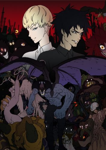
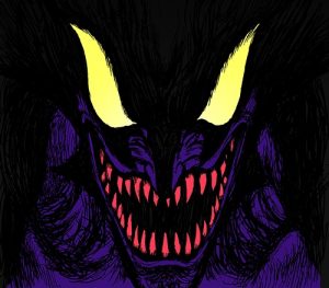
There’s no denying that Nagai’s original character designs for Devilman are iconic. Nearly every adaptation has kept Akira and Ryo’s massive sideburns, Miki’s bob hairstyle and red dress, and Sirene’s head wings. And while Crybaby keeps the demons’ appearances pretty much the same, it takes the human characters in a completely different direction.
Most notable is Ryo, who has traded in his ‘70s bad boy look for a futuristic all-white outfit and undercut. And while this radical change has garnered some backlash, we think that it emphasizes how detached Ryo is from society, especially when surrounded by his pristine modern penthouse and seemingly limitless supply of money and weapons.
Yuasa’s loose animation style causes Ryo’s puffy coat to balloon out to strikingly large proportions whenever he gets caught up in his excitement while hunting demons. And even when he’s stoic and serious, he still munches and swallows the hamburger that Akira shoves in his mouth with a cartoonish gulping motion. Little touches like this give Crybaby’s characters a degree of personality and likeability that a more traditional animation style just wouldn’t have been able to accomplish.
Heightening Moments of Madness
One of the most important themes in both Crybaby and the Devilman series as a whole is how human society and love are the only restraining bolts that keep people from being just as destructive and heartless as the demons. And, fittingly, Yuasa’s art contorts and distorts people the more they give into demon-like urges. Even the “Devilman Dash”, a fan nickname for the animalistic run that Akira and the other track athletes adopt once they’re possessed by demons, physically reflects how these characters have been warped into something far from human.
Along that same line, Akira’s growing sexual urges in episodes 5 and 6 are clear just from looking at him. His eyes go blank (“blinding” him with lust, which is a nice touch), his shoulders broaden and hunch above him, and he shambles around like a zombie. He has a wet dream about Miki, where the frame swims with psychedelic colors and strange body movements. It takes an encounter with Sirene, after which he’s left bleeding on the ground and close to death, for him to finally regain his senses.
But as the anime’s later episodes show, it doesn’t take demonic possession to make someone into a monster. The iconic scene where a lynch mob kills Miki and mounts her limbs and head on pikes doesn’t even show the mob as real people – instead, they’re distorted human-shaped shadows against a background of flames. If we compare this scene to the more realistic version from the OVA Amon: The Apocalypse of Devilman, Crybaby’s surreal animation emotionally resonates with us on a much deeper level.
Cohesion Within Insanity
Masaaki Yuasa has cited Tex Avery cartoons, Wallace and Gromit shorts, and even the Beatles’ Yellow Submarine movie as influences on his work, and it’s easy to see in disjointed, off-the-wall shows like Ping-Pong: The Animation and Mind Game. But even with its exaggerated art style and movements, Devilman: Crybaby is pretty tame in comparison to the rest of Yuasa’s portfolio. What’s the reason for that?
From what we can tell, it’s so that the anime can represent Nagai’s work in a recognizable and marketable way that still pays homage to the original manga artwork. Nagai’s art style changed over the years from a somewhat loose and cartoony look to a more realistic and heavily shaded style that popped up in many of the Devilman spinoff manga. Crybaby’s character designs reflect Nagai’s later artwork, while their rubber-band-like movement is a nod to the early ‘70s Disney-inspired look. This combination gives us memorable character designs that show off the best parts of Nagai’s art, while still being deeply infused with Yuasa’s signature craziness.
Final Thoughts
Devilman: Crybaby just wouldn’t be the same without Yuasa’s quirky animation. It gels well with the fantastic story and intense music to create an anime unlike any other. We’re so glad that we got this adaptation, even though it took over 40 years.
What did you think about Crybaby’s animation? Have you seen anything else by Masaaki Yuasa? Be sure to let us know in the comments, and thanks so much for reading!
Recommended Post
Netflix Anime DEVILMAN Crybaby Reveals Honey's Highlights!
Recommended Post
Devilman Crybaby Review – Devilishly Tragic
Recommended Post
6 Anime Like DEVILMAN Crybaby [Recommendations]
Recommended Post
The Music of Devilman: Crybaby
Recommended Post

