Anime openings are either hit or miss, with very little in between. You are either captivated by the visuals/music of an OP and can’t stop watching it over and over, or it falls flat entirely and just becomes the two minute part you skip every week. The difference between the two can be as little as a personal preference over the music, or it can be a lack of striking visuals, so let’s have a look at what makes the Mieruko-chan OP stand out so much!
Mieruko-chan OP & ED
Stunning Visuals
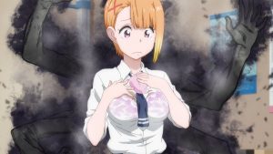
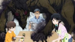
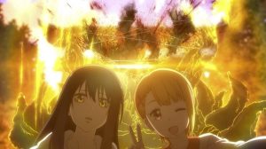
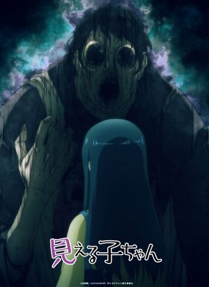
The first to notice is the striking brightness of the colour palette, with neon yellows, blues, and pinks hitting a very bright, white background, which is in stark contrast to the horror theme of Mieruko-chan and the gloominess on Miko Yotsuya’s face as she walks along. However, the bright colours take on a more sinister meaning as the OP progresses, with Miko running through what appears to be puddles of brightly coloured paint as the music tempo intensifies, clearly signalling the use of the bright palette to obscure a gory and otherworldly motif. Hence, the simplistic choice of colour throughout, as the neons catch your eye in front of blank backgrounds, demonstrate how a spirit would do the same walking down a typical city street.
A Musical Tempo to Match
The OP sets the viewer up for the pace of Mieruko-chan through the musical tempo that matches the speed of the visuals. This is to say that the slow start begins to ramp up as the OP progresses, leading into a high tempo, almost frantic, set of bars by Sora Amamiya that serve to induce panic and anxiety into the audience much like the apparitions throughout the anime do to Miko.
The increase in heart rate felt by the quickening tempo of Sora’s words and the electronic beat reminiscent of a 64-bit soundtrack is heightened by the upbeat and melodic chorus that preludes the panic. Similarly to the anime, this creates a sense of relief in between the terror felt by Miko throughout her day, usually emulating the food talk of her best friend, Hana. Finally, the lyrics really add to the motif of panic in normality, with Sora Amamiya constantly repeating “Stop it, stop it, stop it, I’m so scared?!” very quickly, adding to the panic over the upbeat music.
Final Thoughts
Studio Passione clearly put a lot of time and effort into the opening for Mieruko-chan, making sure that the visuals and music presented a similar atmosphere and artistic motif as the rest of the anime. Instead of taking the easier route for a horror anime and using the most striking and grotesque visuals from Mieruko-chan to create an opening, Studio Passione’s choice of an artistic representation of the main plot through colour contrast and increasing tempo music is a unique way to grab your audience's attention. What did you think of the Mieruko-chan opening? Did it catch your eye, too, or did it fail to grasp you? Let us know in the comments!
Recommended Post
Mieruko-chan Review – Spooky, But Surprisingly Wholesome
Recommended Post
The 5 Scariest Ghosts In Mieruko-chan Still Give Us Nightmares
Recommended Post
Mieruko-chan’s Fresh Take on the Horror Genre
Recommended Post


