If you read enough manga, you’ll begin to see patterns in how artists draw their characters and worlds. But where did the big eyes, spiky hair, and everything else we associate with manga come from in the first place? And how have artists throughout the decades used and modified these ubiquitous motifs to suit their stories? Let’s take a short dive into the most common manga drawing styles and what we can learn from them!
Early Shounen
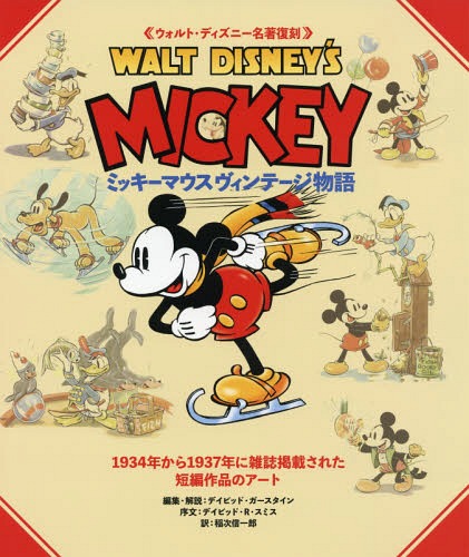
Manga art’s biggest overall influence comes from none other than Disney cartoons. Specifically, the ‘30s and ‘40s Mickey Mouse shorts that Japanese people were exposed to following the Second World War. The works of Osamu Tezuka (Astro Boy, Dororo), Shotaro Ishinomori (Cyborg 009), and Go Nagai (Devilman, Mazinger Z) use rounded character designs and large eyes that clearly take inspiration from early Western animation.
In the ‘80s and ‘90s, shounen manga would shift towards a more angular style that worked well for fight scenes and emphasized their protagonists’ fiery personalities. Akira Toriyama’s striking art in Dragon Ball/Dragon Ball Z would encourage other series like Fairy Tail and Slayers to follow in its footsteps, giving characters bright fantasy outfits and spiky hair to make each cast member stand out and look like they could kick someone’s ass.
Modern Shounen
Today, shounen art has stepped in a slightly different direction. Spiky hair and comedic mainstays like sweatdrops and chibis have become cliché, so some series like The Promised Neverland and later volumes of Katekyo Hitman Reborn have mixed in elements like exaggerated horror imagery and techniques that mimic camera effects to add a more adult flavor to their art.
What’s most important about art for shounen is that it has to be exciting and instantly memorable at first glance. If a design is too complicated, readers won’t be able to follow action scenes or know who a character is from every angle. Just like Mickey Mouse, shounen art works best when it’s simple, eye-catching, and iconic.
Early Shoujo
Shoujo, on the other hand, tends to move at a slower pace than its male-oriented counterpart. Narratives that focus on romance and interpersonal conflict will benefit from lingering on a character’s face or body language to properly express the complex emotions they’re feeling. Early shoujo manga used long, soft faces and eyes to evoke an atmosphere of theatrical melodrama that suited these over-the-top stories. Chiho Saito (Kanon, Revolutionary Girl Utena), Naoko Takeuchi (Sailor Moon), and Riyoko Ikeda (Rose of Versailles) are particularly good examples. You can even see echoes of the rounded Disney style in Rose of Versailles, since it’s from the early ‘70s.
Modern Shoujo
Modern shoujo has splintered off from lanky soap opera characters into a number of different aesthetics, such as moe cuteness in Blend S and Bloom Into You or more rounded and accurate body proportions in Orange. You can even see the change in style by comparing earlier volumes of the long-running romance manga Fruits Basket to later ones–the skinny, angular designs change to be more subdued and realistic as the years go by.
With shoujo, readers want to see every minute expression on a character’s face as they muster up the courage to confess to their crush. They want to see gorgeous gowns in period pieces, adorable school uniforms in slice-of-life series, and the most beautiful men and women imaginable falling in love with each other. Rather than being recognizable from a distance, the best shoujo designs are detailed enough to give readers the emotional eye candy experience they expect.
Exceptions
Of course, some artists just go in a completely different direction for the fun of it. For example, Junji Ito famously spends hours on excruciatingly complex horror art that invokes a deep sense of fear and dread when you turn the page and find it staring into your soul.
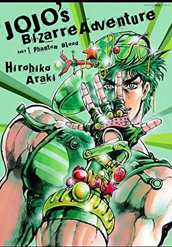
Hirohiko Araki takes heavy inspiration from Greco-Roman art and fashion magazines, elevating the style of JoJo’s Bizarre Adventure from traditional ‘80s shounen to a mixture of masculinity and camp wholly unique to itself. And the webcomic artist One uses his intentionally amateur drawings as both parody and a genuinely new art style. You can trace some of their influences back to the same sources as more traditional artists, but these mangaka deliberately look to unusual places for their inspiration to set themselves apart from the rest.
Final Thoughts

Now that you know a bit more about the origins, purposes, and shifting trends of manga art styles, take a closer look at some of your favorite manga. Where do they fit in the timeline? Who could they have taken inspiration from? Do they take an unusual path that gives them a unique look? Let us know in the comments what you find, and thanks so much for reading!


