También puedes leer este artículo en:Español
Guess we don’t have to introduce this anime or any of the backstory by now, right Pokemon trainers? It has been a long way since 1995, when Satoshi Taijiri created the franchise. Lots of movies, games, and props later, the anime series still goes on! I mean, who does not know Pikachu by now? Long live Pokemon!
Of course, if you are into the games, you may already have a large collection of critters. There are over 700 of them! Naturally, such a big family has their odd ones too. But taking into account that the character designers of Pokemon get their inspiration mainly from real animals, plants, and insects, sometimes we encounter a Pokemon that makes us shout: wait, this is so plainly lazy! Wanna meet a few of these lazy pokemon designs? Let’s go!
10. Unown
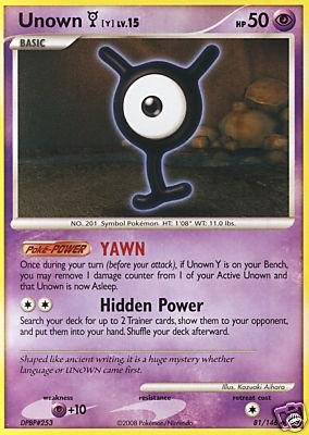
- Generation: Second
- Pokedex: 201
One fine day, the character designers of Pokemon decided to take the ABC and transform it into a Pokemon. So, they added one eye and some appendices to the letters. And presto! Here we have the Unown, who, if they are together, can get enough power to alter the perception of reality.
So now even old languages are going to become Pokemon? Unknown is known as the most “non evolving” Pokemon ever made. The great irony is that languages and writing systems are always evolving. This is an example of an interesting design concept that went right down to the weird lane. It is what happens when you want to create many Pokemon at the same time with the minimum effort u.uU
9. Ditto
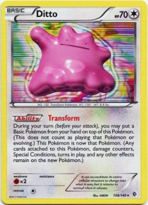
- Generation: First
- Pokedex: 132
Yes, we understand that the first Pokemon generation was limited to a pixelated world. But you have to admit that an ameba is not precisely the most creative design ever, right? Besides that, Ditto is a normal type Pokemon. He only can do two things: breed with other Pokemon, and an attack called Transform.
Ditto’s abilities might look useful at first, as he can copy the appearance of other Pokemon… but if he is paired in battle with another Ditto, they will be stocked copying each other forever. That is why trainers never use Ditto in battle. The poor guy has a nice personality, but at least its creators could have given him a slightly more complicated appearance. Ditto is simply too plain.
8. Bruxish
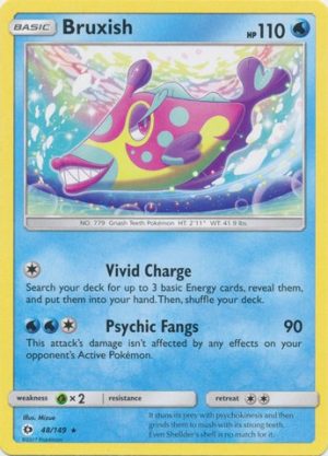
- Generation: Seventh
- Pokedex: Unknown
Meet one of the newest Pokemon! Bruxish is part of the Sun/Moon gang. We know that this Pokemon arch is based on the tropical zones of the world, but… Did we really need such a color palette? Instead of looking warmly exotic, Bruxish looks like a berry ice-cream wannabe.
Maybe the creators wanted it to look feminine, but isn’t the addition of eyelashes and that prominent mouth just a little bit too much? We cannot talk about its battle moves because they have not been revealed, but all in all, Bruxish gives us the impression of having been approved too quickly from the first drafts on the drawing board.
7. Klink
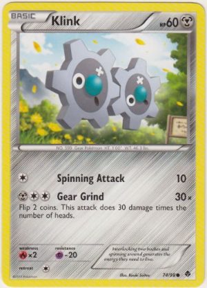
- Generation: Fifth
- Pokedex: 599
Ok Pokemon designers, we get it. Sometimes you run out of ideas or want to be more creative by adding critters based on objects. But two gears? With one round eye and an x shaped eye? And look at those permanently open mouths.
In a generation that gave us cuties like Snivy, Tepig and Munna, who is gonna sympathize with two gears? And don’t start us on Klink’s evolutions. Just add one more gear, and you get… Klang. Add yet another thin gear and you get Klinklang (facepalm). Even their names can be subject to ridicule. Maybe the creators tried to compensate their looks with some pretty solid battle abilities, but that does not take out the fact that Klink and its evolutions are lazy designs.
6. Trubbish
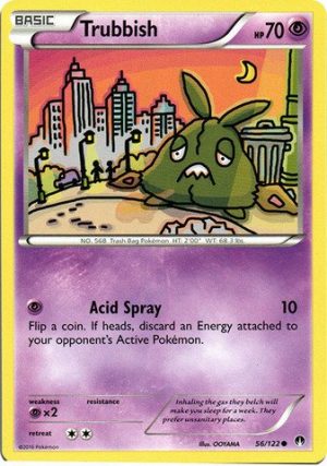
- Generation: Fifth
- Pokedex: 568
Apparently, even garbage can become a Pokemon in the Pokemon world. Trubbish is a bag where chemical reactions are always taking place. And what happens when it evolves? The bag breaks and it becomes Garbodor, a bigger pile of garbage.
This design is not only bad and messy, but it also has conceptual problems. See, not all garbage has to be poisonous or damaging. Some of it can be recycled to become new products and other can be used to fertilize plants. As a poison Pokemon, the only thing we can get out from Trubbish and company is that being garbage is wrong. Who is going to take out this smelly and dangerous guy out of the Pokeball? He is not even nice to watch. Again, this is what happens when you get out a character too early out from the drawing boards.
5. Vanillite
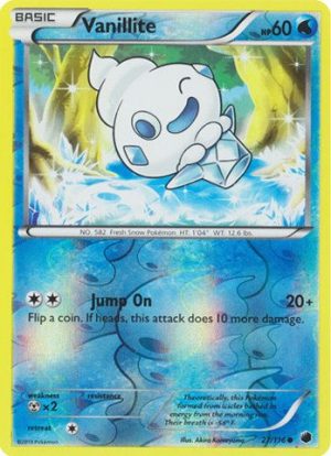
- Generation: Fifth
- Pokedex: 582
At this stage, we can notice the Fifth generation gave us some of the worst Pokemon designs ever. Anyway, let’s continue with Vanillite. Here we have an ice cream cone with a face. That’s it.
Besides being uncreative, the face is not even pleasant enough. And just wait until Vanillite evolves to Vanillish and Vaniluxe. Its face becomes even weirder and its character worsens. Maybe if the creators combined the concept of an ice-cream with a plant, animal or insect, something cute and powerful would have emerged. But nah, the design was left to be lazy.
4. Binacle
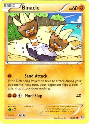
- Generation: Sixth
- Pokedex: 688
We understand that some Pokemon just try to be funny. Nevertheless, sulky Pokemon should be better thought than this specimen. Binacle is composed of two bad tempered hands who live in a rock. The thing is that, when they get too angry, one of them moves to another rock. So, is this one or many Pokemon?
Binacle is not only confusing, it is also visually unappealing. Although he becomes more integrated in his evolution (Barbaracle), it is easily forgettable compared to other better designed fighting Pokemon. So sorry, Binacle. You are not necessary in our Poke hearts.
3. Shirodesuna
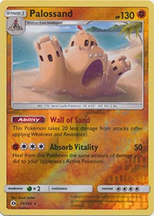
- Generation: Seventh
- Pokedex: Unknown
There is a Pokemon in the Seventh generation that is called Sunabaa. Basically, it is a ghost made of sand. Ok, maybe the concept is not that lazy, we can pass it. But when it “evolves”, it becomes Shirodesuna.
Just look at this sand castle with a shovel on its head. What is powerful or scary about it? And look at those heart decorations. Let me repeat that: the freaking ghost Pokemon has colorful heart decorations! We can just wonder exactly how Shirodesuna attacks or defends, but we are not expecting much of it. It is condemned to not be taken seriously since his design is just… well… something we would play with in our summer vacations.
2. Silcoon and Cascoon
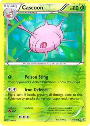
- Generation: Third
- Pokedex: 266, 268
These two are paired because they look so similar they could be confused. Yes, we understand some Pokemon are similar to insects that go through metamorphosis. There are two ways you can deal with their designs: either make their transformation motionless (like in real life), or make an interesting intermediate stage like Metapod. But these two guys? They are basically cocoons with spikes and eyes, with some weird lines indicating their silk threads. There is not even care shown in their overall appearance.
Maybe the creators noticed that Silcoon and Cascoon were not precisely their most popular Pokemons, so they have made them completely round in the recent versions of the game. Unfortunately, the weird lines and eyes are still there, so the lack of spikes adds to the confusion of who is who. So, nope. their designs are too lazy.
1. Luvdisc
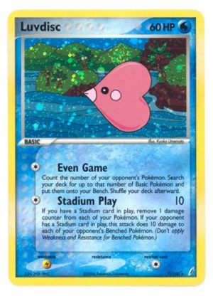
- Generation: Third
- Pokedex: 370
And the ultimate lazy Pokemon design prize goes to… the cheesiest critter ever! We can only imagine it is a hard day’s night in the design department and you have to finish the proposal for the one hundred something new Pokemons. Just one more and you will be off. So, anything goes.
How about this heart with a mouth, eyes and cheeks? It is supposed to be a fish, but come on! Magikarp might be useless, but at least looks like a complete fish. Besides that, Luvdisc does not even evolve or attack. It simply lives together with other Luvdiscs. On looks and abilities, this fish is the laziest Pokemon ever.
Final thoughts
Pokemon has been one of the longest running franchises in anime as well as game. We can see that, most of the time, it’s wonderful variety of critters has conquered the hearts of millions of fans around the world. Nevertheless, sometimes even the best character designers make mistakes or rush things away. That is why we have this curious list of Pokemon, who reminds us to be careful when we develop our own characters.
So, did you like our selection of lazy designed Pokemons? Which other Pokemon was not designed carefully on your opinion? Don’t forget that we are open to all your comments and suggestions. See you soon!
Recommended Post
Top 10 Controversial Pokémon
Recommended Post
Top 10 Psychic Type Pokémon
Recommended Post
Pokémon GO Adds Next Evolution of AR with AR+ Mode
Recommended Post
Top 5 Normal Pokemon in Sun and Moon
Recommended Post

